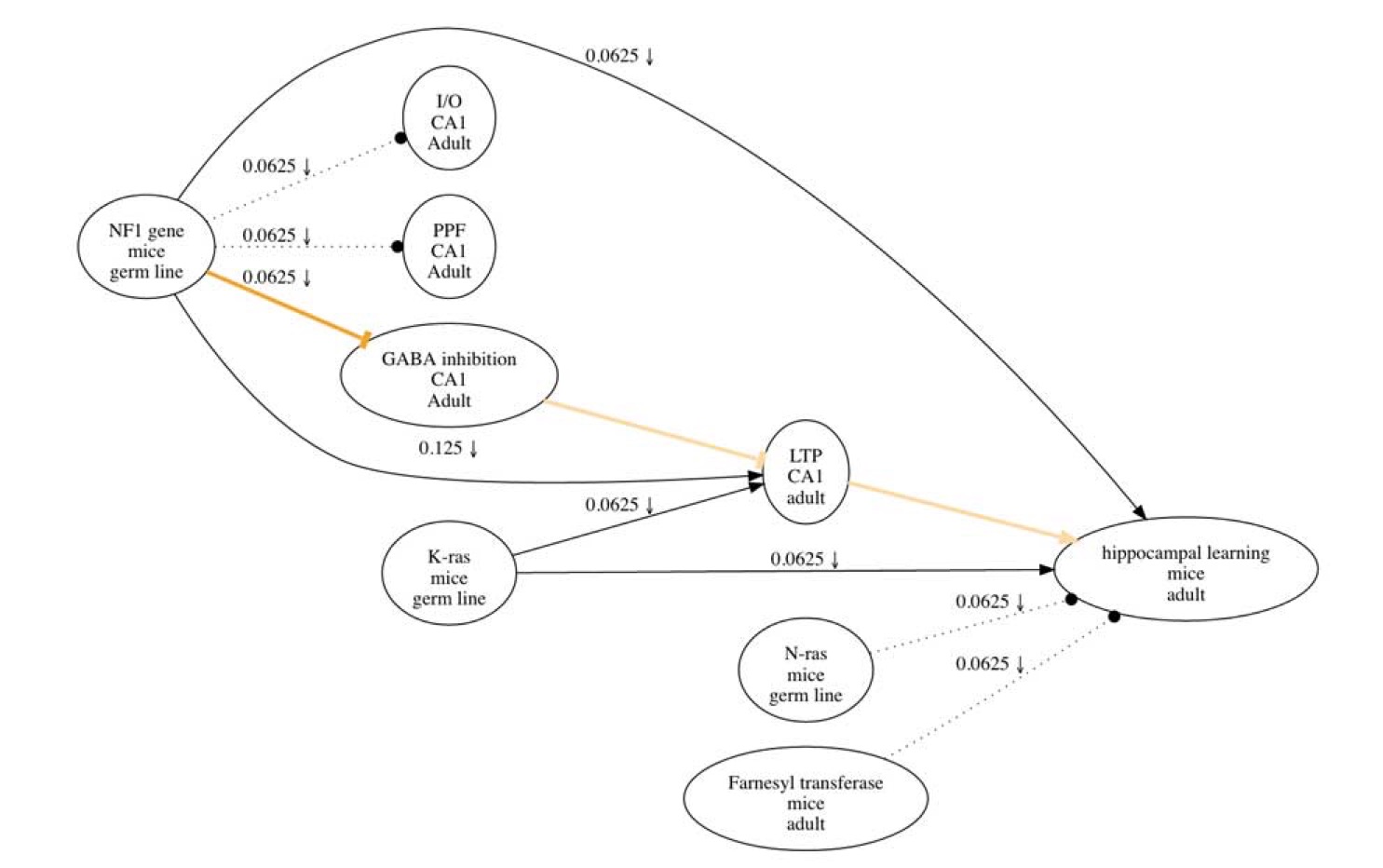
The figure above shows a researchmap representing results in a published paper (Costa et al., 2002). Each node in the graph has three items that describe the “What” of the item (top; e.g., name), as well as the “Where” (middle; spacial/source information that distinguishes the item) and the “When” (bottom; temporal information that defines the item) information that defines it. Nodes are connected by edges that characterize the nature of the causal relations represented, including excitatory (sharp edges), inhibitory (dull edge) and no relation (dotted line). Each edge also has a score that reflects the amount of evidence represented, and symbols that reflect the types of experiments carried out, including upward arrow for Positive Manipulations (that increase the probability of A and look at the impact on B), downward arrow for Negative Manipulations (that decrease the probability of A and look at the impact on B). Non-intervention (positive and negative) experiments simply track how A and B co-vary. Edges representing key hypothetical information mentioned in the paper do not have any weights or experiment symbols. Key edges for the main theses in the paper are highlighted in yellow in the map. This map was derived with a free web app that helps with the process of making research maps (www.researchmaps.org).
We have written a book on this subject with the very modest title of :) “Engineering the next revolution in neuroscience: the new science of experiment planning”. We have also written several articles on the subject including a Neuron (PDF) and a Learning and Memory (PDF) paper that summarize our ideas on this subject. For a recent Ray Kurzweil's newsletter article on our work click here...
